


Spaces that feel as good as they look

When people think about colour in interior design, they often focus on appearance. Yet colour is not experienced through sight alone. Texture and touch play a significant role in how colours are perceived, influencing the mood, comfort and character of a space. The interaction between colour and texture can transform an ordinary room into an environment that feels warm, sophisticated, energetic or calming.
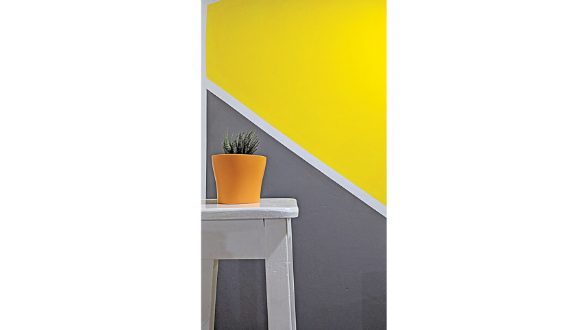
Texture refers to the surface quality of a material. It may be smooth, rough, glossy, matte, soft or hard. These characteristics affect the way light interacts with a coloured surface, altering how the colour appears. For example, a deep blue paint with a matte finish may create a soft and cosy atmosphere, while the same shade in a high-gloss finish can feel modern, vibrant and dramatic.
 For all latest news, follow The Daily Star's Google News channel.
 Natural materials often demonstrate the powerful relationship between colour and texture. Wood, stone, brick and fabric each possess unique surface qualities that influence their visual impact. A warm beige wall may appear understated on a smooth painted surface, yet the same colour applied to textured plaster can add depth and richness. Similarly, earthy green tones paired with natural wood grain can evoke a sense of tranquillity and connection to nature.
Touch also shapes our emotional response to colour. Soft furnishings such as cushions, rugs and curtains introduce tactile experiences that enhance a room’s colour scheme. Velvet fabrics, for instance, reflect light differently across their surface, giving colours a luxurious depth. Linen and cotton, on the other hand, offer a more relaxed and casual appearance. The physical sensation of touching these materials reinforces the emotional qualities associated with their colours.
The growing popularity of textured wall finishes, decorative paints and specialised coatings reflects a broader appreciation for multi-sensory design. Textured finishes can add dimension to neutral palettes, preventing them from feeling flat or monotonous. Even subtle variations in surface texture can create visual interest without relying on bold colours.
Lighting further strengthens the connection between texture and colour. Natural and artificial light interact differently with textured surfaces, producing shadows and highlights that change throughout the day. As a result, colours may appear richer, softer or more dynamic depending on the surrounding environment.
Ultimately, successful colour design goes beyond selecting attractive shades. It involves understanding how texture and touch influence perception and experience. By carefully combining colour with tactile materials and varied surface finishes, designers and homeowners can create spaces that engage the senses and foster comfort, beauty and emotional well-being.
In modern interiors, colour is not simply something we see—it is something we feel.


Comments