


A guide to colour and finish

Choosing the right paint for your home is often perceived as a purely aesthetic exercise. However, anyone who has ever seen a beautiful seafoam green turn into a hospital-ward neon under fluorescent lights knows there is a deeper science involved. Understanding the color palette of your home requires a balance between the psychology of color, the physics of light, and the chemistry of paint finishes.
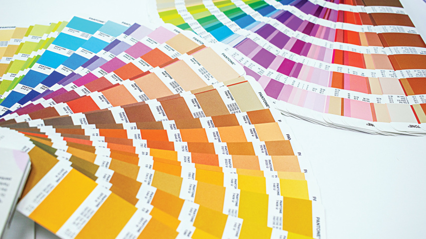
WHY THE “TYPE” OF PAINT MATTERS
 For all latest news, follow The Daily Star's Google News channel.
 Before you fall in love with a swatch, you must understand “sheen”—the gloss level of the paint. The sheen doesn’t just affect how the color looks; it dictates how the paint performs under pressure.
Flat/Matte: This finish has the highest pigment concentration and the lowest light reflection. It is excellent at hiding surface imperfections like uneven plaster or patch jobs. However, it is the hardest to clean. Best for: Adult bedrooms and ceilings.
Eggshell and Satin: These are the “workhorse” finishes of the modern home. They offer a soft, candlelit glow and are significantly more durable than matte. Satin is slightly glossier and more moisture-resistant. Best for: Living rooms, hallways, and dining areas.
Semi-Gloss and High Gloss: These are the most durable and easiest to clean. They stand up well to moisture and frequent scrubbing. However, they highlight every bump and crack on a wall. Best for: Kitchens, bathrooms, baseboards, and window trims.
SETTING THE MOOD
Color dictates how a room “feels.” When designing your palette, the most effective tool is the 60-30-10 Rule. This suggests that 60% of your room (usually the walls) should be a dominant color, 30% (upholstery or rugs) a secondary color, and 10% (pillows or art) a bold accent color.
The Social Spaces (Living and Dining): Warm neutrals—like “Greige” (a mix of gray and beige) or warm whites—create an inviting atmosphere. If you want to spark conversation, a deep navy or terracotta accent wall can add a sense of sophisticated energy.
The Restorative Spaces (Bedrooms): To encourage sleep, look to the cool side of the color wheel. Soft blues, sage greens, and muted lavenders lower the heart rate and suggest serenity. Avoid bright reds or oranges here, as they are “high-energy” colors that can interfere with rest.
The High-Energy Spaces (Kitchens and Offices): Yellows and bright whites promote clarity and alertness. In a kitchen, crisp whites or light grays suggest cleanliness and help food colors pop.
THE GREAT DECEIVER
The biggest mistake homeowners make is choosing a color in the bright, artificial light of a showroom. Light is the most important variable in how a color appears.
North-Facing Rooms: These rooms receive a consistent but cool, bluish light. Cool colors like gray or light blue can look chilly or “dead” here. To counteract this, use paints with warm undertones (creams or yellows).
South-Facing Rooms: These are flooded with intense, warm sunlight. Most colors look great here, but very light colors may look washed out. This is the perfect place for “moody” or darker palettes that can handle the intensity.
Artificial Light: LED and incandescent bulbs have different “color temperatures.” “Warm White” bulbs make reds and yellows pop, while “Cool White” bulbs favor blues and greens.
THE HIDDEN LAYER
In tropical or humid climates, a color palette is only as good as the protection beneath it. Authentic home improvement requires looking for functional benefits. For example, in kitchens and bathrooms, look for “Anti-Bacterial” or “Easy Clean” formulations. These paints contain specialized resins that prevent steam and grease from penetrating the pigment, ensuring that your “Eggshell White” doesn’t turn yellow within a year.
Furthermore, if your home is prone to dampness—a common issue in deltaic regions—your color choice must be supported by a Waterproofing and Construction Chemical (WPCC) base. Without proper surface preparation and a high-quality primer, even the most expensive premium silk finish will eventually peel.
THE TESTER RULE
Never paint a whole room based on a tiny card. Buy a “tester pot” and paint a 2-foot by 2-foot square on at least two different walls. Observe that square at 10:00 AM, 4:00 PM, and 9:00 PM under lamplight. Only when you love the color at all three times are you ready to commit to the palette.
By matching the right sheen to the room’s function and the right tone to the room’s light, you transform your house from a mere structure into a curated, resilient home.


Comments