Graphic modernity: Bengali artists and the politics of book design
The Franklin Book Program in Pakistan is often remembered primarily as a project of Cold War cultural diplomacy and educational reform in the country’s early years of independence. Yet its most compelling legacy may lie elsewhere—in the hands of artists who transformed translated books into vehicles of visual modernity. In East Pakistan, designers AKM Abdur Rouf and Qayyum Chowdhury used the program’s publishing platform to develop a new aesthetic language for a decolonising society. Working at the intersection of global modernism and regional artistic traditions, they turned book design into a site of cultural negotiation, where diplomacy, pedagogy, and postcolonial identity converged. This article shows how the Franklin Book Program was not merely an American initiative but a collaborative space where local artistic agency redefined the meaning of cultural exchange.
AKM Abdur Rouf: Visual architect of a nation
In the story of modern Bangladeshi visual culture, few figures stand out as clearly and consistently as AKM Abdur Rouf (1931–1978). Born in the Khulna region of Bengal, Rouf’s career unfolded alongside the emergence of Bangladesh itself, culminating in his historic role as the calligrapher of the original Constitution of Bangladesh in 1972. Deeply committed to art, education, and public service, Rouf was not only a master calligrapher but also a prolific book designer, illustrator, and influential figure in shaping modern graphic design in the region. His legacy, particularly his involvement with the Franklin Book Program during its formative years in East Pakistan, demonstrates how graphic design could articulate the cultural aspirations of a society moving towards decolonisation and nationhood.
Trained at the Government College of Arts and Crafts in Dhaka, Rouf combined rigorous academic discipline with a spirit of experimentation. Further professional training in London in the early 1970s expanded his visual vocabulary, situating his practice within both local and international design currents. His most distinctive work emerged from a deeply Bengali sensibility, drawing on folk traditions, Islamic geometric ornamentation, and modernist principles of clarity and structure. Across calligraphy, illustration, and book design, his artistic language fused bold abstraction, rhythmic symmetry, and an exceptional sensitivity to typography.
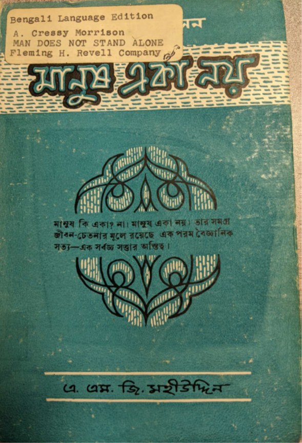
Rouf’s work with Franklin Publications in the early 1960s marked a formative moment in the visual culture of publishing in East Pakistan. The Franklin Book Program, supported by American philanthropic and diplomatic networks during the Cold War, sought to make global literature accessible through translation into local languages. Rouf’s designs for Bengali editions exemplify what may be described as transcultural modernism: the translation not only of texts but also of visual forms, where Western literary content was reimagined through Bengali artistic traditions and design idioms. Two of AKM Abdur Rouf’s most compelling cover designs—Dui Diganto, the Bengali translation of Pearl S. Buck’s East Wind: West Wind, and Manush Eka Noy, the Bengali edition of A. Cressy Morrison’s Man Does Not Stand Alone—exemplify his ability to navigate the complex terrain of cross-cultural visual communication with remarkable sensitivity and innovation.
Pearl S. Buck (1892–1973) was an American novelist renowned for her vivid portrayals of Chinese life. She won the Pulitzer Prize for The Good Earth in 1932 and the Nobel Prize in Literature in 1938, becoming the first American woman to receive the award. East Wind: West Wind explores the encounter between tradition and modernity in early twentieth-century China. Told through the perspective of a young woman in a conservative household, the novel depicts how Western ideas, brought home by her Western-educated husband, gradually transform family life, gender roles, and personal identity within Chinese society. Translated by Abdul Hafiz as Dui Diganto, the title literally means “Two Horizons” in English. Its metaphorical resonance evokes themes of duality, cultural encounter, and divided perspectives, reflecting the central concerns of East Wind: West Wind.
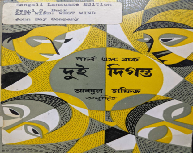
Rouf’s cover design for Dui Diganto transforms these themes into a striking visual metaphor. Four fragmented human faces orbit a luminous yellow sphere, forming a composition of geometric abstraction that conveys the novel’s central concerns—divided identity, cultural dislocation, and emotional fragmentation. The design’s modernist vocabulary—angular contours, a stark triadic palette of black, white, and ochre, and an almost symmetrical layout—is formally austere yet emotionally resonant. The yellow circle, enclosing the Bengali title, radiates warmth and serves as the composition’s central anchor, suggesting a sun or nucleus of consciousness around which fractured expressions revolve—a visual reflection of the protagonist’s struggle for selfhood amid cultural estrangement. The disjointed faces articulate introspection, alienation, and identity crisis, resonating with Buck’s nuanced portrayal of intercultural subjectivity. Rouf’s visual rhythm, inflected by both Cubist fragmentation and folk-modernist stylisation, channels the psychological depth of the characters while evoking the broader East–West dialogue that frames the novel.
A. Cressy Morrison (1885–1961) was an American chemist and long-time president of the New York Academy of Sciences. His Man Does Not Stand Alone (first published in 1944) presents a scientific and philosophical defence of theism, arguing that the order, complexity, and harmony revealed by the biological, physical, and astronomical sciences point towards the existence of a divine creator. Written in dialogue with contemporary scientific thought, including the ideas of Julian Huxley, the book contends that scientific discovery affirms rather than undermines religious belief.
Translated as Manush Eka Noy by A. G. M. Mohiuddin, the title corresponds precisely to A. Cressy Morrison’s original book, Man Does Not Stand Alone. Rouf’s design for the Bengali edition moves in a different direction—towards abstraction that is spiritual, symbolic, and deeply rooted in regional aesthetics. The central motif is a mandala-like geometric form, drawn in sharp white lines against a deep blue background. This design draws on Islamic ornamentation, Bengali alpana, and the visual logic of modernist abstraction to create an image that operates as both an aesthetic object and a metaphysical diagram. It signifies interconnectedness, divine harmony, and the unity of creation—key themes in Morrison’s theological argument. The deep blue ground suggests cosmic depth, introspection, and the infinite, while the radiant geometry echoes both scientific diagrams and sacred visual traditions. The deliberate absence of figuration aligns with Islamic aniconism and emphasises the universal, non-denominational tone of the book’s spiritual message. Rouf’s controlled palette and elegant typographic treatment lend the cover an intellectual gravity and composure—hallmarks of mid-century modernist ideals of form as a vehicle for truth.
In both designs, Rouf demonstrates an extraordinary capacity to interpret literary content through a culturally attuned, visually sophisticated language. These covers do not merely introduce the books they enclose; they reframe them, translating complex philosophical and emotional ideas into a visual idiom that is at once modern, local, and transcultural. What distinguishes Rouf’s Franklin designs is his ability to synthesise diverse aesthetic traditions into a coherent visual language. He was equally comfortable drawing from Cubism and Nakshi Kantha, Islamic geometry and Bauhaus typography. His training, exposure to international design practices, and sensitivity to local cultural codes allowed him to create covers that felt both global and rooted. These were not merely functional book jackets; they were visual essays that interpreted, distilled, and localised the texts they enclosed. Rouf’s design ethos aligned with the Franklin Program’s mission of cultural translation—not just linguistic, but visual and ideological.
Outside the Franklin initiative, Rouf’s contributions continued to shape the visual identity of Bangladesh in the decades following independence. His calligraphic rendering of the Constitution of Bangladesh in 1972 stands as a monumental achievement, uniting political symbolism with artistic mastery. Rouf was also associated with early preservation efforts that contributed to the establishment of the Bangladesh Film Archive, helping collect and safeguard materials related to the country’s cinematic heritage. Often credited with designing more than 2,800 book and magazine covers across Bangladesh, India, Pakistan, and the United Kingdom, Rouf produced one of the most extensive individual bodies of graphic design work in South Asian publishing. His calligraphic contributions to documents connected with the South Asian Association for Regional Cooperation (SAARC) Charter, along with murals for diplomatic missions and extensive newspaper design work, demonstrate a lifelong engagement with art as a form of public culture and national representation.
AKM Abdur Rouf was not just an illustrator or a calligrapher—he was a visual architect of Bangladesh’s postcolonial identity. His Franklin-era work demonstrates the power of graphic design to mediate between cultures, to visualise complex ideas, and to educate without didacticism. In an era before digital tools and globalised aesthetics, Rouf’s covers carved out a distinct visual modernity—at once Bengali, Muslim, South Asian, and cosmopolitan. His work continues to inspire designers, artists, and scholars who seek to understand how images shape thought, and how design can become an act of nation-building.
Qayyum Chowdhury and the art of visual translation
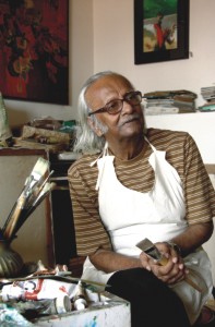
Qayyum Chowdhury (1932–2014) was more than just a painter—he was a cultural force whose work shaped the visual imagination of postcolonial Bangladesh. As one of the founding figures of modern Bangladeshi art, alongside Zainul Abedin, Quamrul Hassan, and Safiuddin Ahmed, Chowdhury's legacy spans painting, illustration, book design, and education. His artistic career, which began in the early 1950s, coincided with the birth of a new nation and the aspirations of a generation seeking to define a modern Bengali identity rooted in indigenous aesthetics.
Born in Feni, East Bengal, in 1932, Chowdhury’s formative years were shaped by his exposure to the lush landscapes of Bengal and the cultural vibrancy of cities like Chittagong, Comilla, and Mymensingh. His early love for illustrated books, especially Bengali detective fiction and literary magazines like Bangashree and Basumati, sparked a fascination with visual storytelling. This sensibility would become central to his later work as an illustrator and book designer. Trained at the Dhaka Art Institute—then a nascent institution modelled on nationalist aspirations and influenced by the Bengal School—Chowdhury came under the mentorship of Zainul Abedin and Quamrul Hassan, who shaped his understanding of art as both a personal and public act.
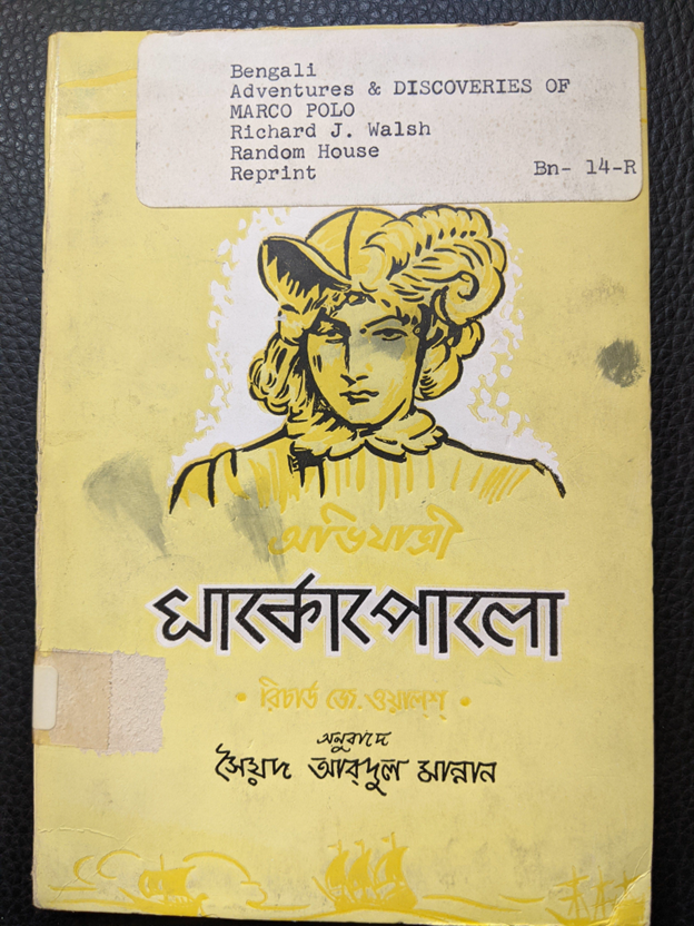
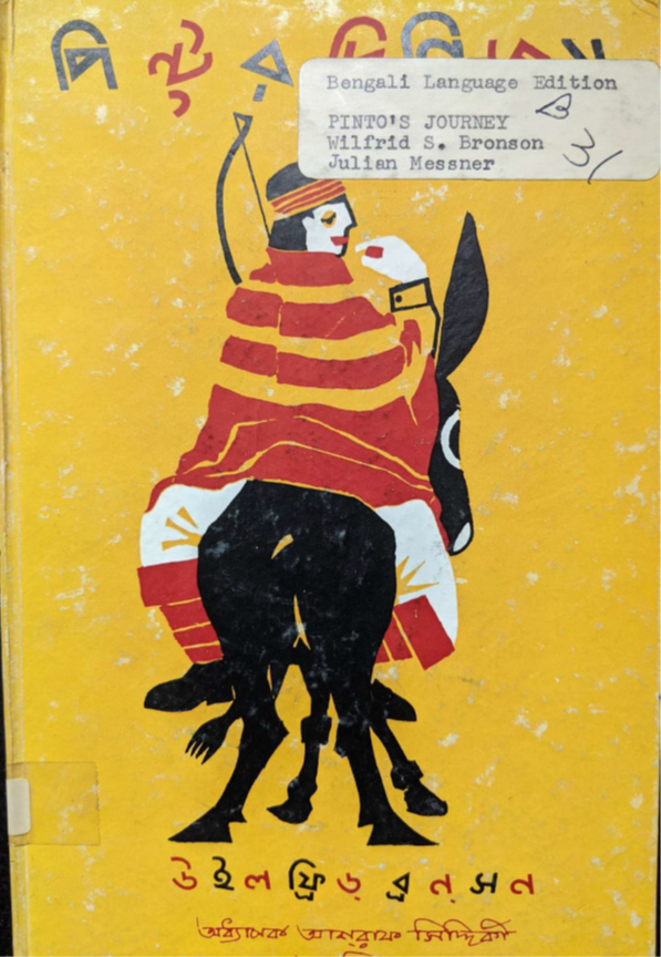
Though best known for his evocative paintings—such as My Sister (1954), Boat in Moonlight (1956), and Abohoman (2004)—Chowdhury’s parallel career in graphic design and illustration was equally impactful. He worked with publishing houses, newspapers, and institutions to shape a distinctly Bengali visual idiom for mass audiences. Among his most significant contributions in this regard were his collaborations with the Franklin Book Program in the 1950s and ’60s. For Chowdhury, the program offered an opportunity to fuse his artistic ideals with a pedagogical and cross-cultural mission. His artistry is particularly evident in two cover illustrations celebrated for their visual intelligence, aesthetic clarity, and cultural resonance: one for the Bengali translation of Richard J. Walsh’s Adventures and Discoveries of Marco Polo, and the other for Wilfrid S. Bronson’s Pinto’s Journey.
Richard J. Walsh (1886–1960) was an American author, editor, and publisher. In Adventures and Discoveries of Marco Polo, he presents the famed 13th-century explorer’s journeys across Asia in a style accessible to general and young adult readers. The book traces Marco Polo’s travels along the Silk Road, his experiences at the court of Kublai Khan, and his observations of Asian societies, highlighting their lasting influence on global trade and European perceptions of the East.
The Bengali translation by Syed Abdul Manan, Abhijatri Marco Polo, meaning “Explorer Marco Polo”, is presented in bold script, combining stylised calligraphy with geometric typography. The pervasive use of yellow throughout the design may be read symbolically, suggesting enlightenment, discovery, and intellectual curiosity, all themes central to both the explorer’s historical legacy and the book’s pedagogical purpose. The cover design is deceptively simple yet deeply intentional. A head-and-shoulders portrait of Marco Polo dominates the upper half of the composition, rendered in bold black contour lines and animated by expressive yellow brushwork. His feathered hat, flowing hair, and noble attire draw on European Renaissance imagery, but the overall layout and aesthetic localise the figure within a distinctly Bengali design sensibility. The pale yellow background and balanced composition evoke a sense of calm and clarity—qualities especially suited to an educational text aimed at younger readers.
Here, Chowdhury accomplishes multiple goals: he presents a European historical figure in heroic yet human terms; he maintains visual harmony through a restrained colour palette; and he frames the global within the local. The design does not overwhelm; rather, it invites. The portrait’s white halo subtly guides the viewer’s focus, while the modest, balanced composition allows the title and image to coexist without clutter. In the context of Cold War-era development discourse, Marco Polo becomes a stand-in for the virtues of curiosity, knowledge acquisition, and peaceful cross-cultural exchange—values aligned with the Franklin Program’s soft-power ambitions.
Wilfrid S. Bronson (1894–1971) was an American author and illustrator known for his engaging natural history books for children. In Pinto’s Journey, Bronson presents an illustrated travel narrative following a burro named Pinto and his young owner as they traverse the American Southwest. Blending entertaining storytelling with elements of natural history, the book introduces young readers to the region’s diverse landscapes, wildlife, and cultures, offering an educational and imaginative exploration of geography and ecology through the perspective of a child and his animal companion.
Qayyum Chowdhury’s cover design vividly reflects his folk-modernist aesthetic, more overtly than in his other Franklin work. The composition is both symbolic and expressive: a solitary rider, draped in red and yellow stripes, is seated atop a stylised black donkey. The mustard-yellow background, combined with bold black outlines and flat planes of colour, evokes the handcrafted quality of patachitra (scroll painting) and rural Bengali signage. The donkey’s exaggerated, almost multi-limbed form introduces an intentional ambiguity and sense of movement, transforming a straightforward travel story into a layered visual metaphor. The rider’s backward glance adds psychological nuance, suggesting introspection or duality—perhaps reflecting tensions between past and future, or between personal and collective journeys.
The typography is especially striking. The Bengali title dances playfully across the top in irregular, rhythmic characters, evoking a sense of musicality that resonates with the book’s folkloric and allegorical tone. The entire composition operates not just as an illustration, but as a visual narrative in its own right. Where the cover for Marco Polo emphasised formal clarity and balance, Pinto’s Journey introduces dynamism, ambiguity, and symbolic depth. The bold, limited colour palette—partly a necessity of mid-century printing constraints—is transformed by Chowdhury into a strength, enhancing contrast, legibility, and emotional impact.
In both cases, the covers are not mere illustrations of the content; they are acts of interpretation. Chowdhury reads these texts not through a literal lens but through a semiotic one, drawing out their deeper themes: exploration, movement, cultural encounter, and human resilience. His work for the Franklin Book Program reveals a crucial facet of his career—his role as a cultural mediator who helped introduce global narratives to Bengali readers in ways that were visually compelling, culturally sensitive, and pedagogically effective. These covers also remind us that illustration, often dismissed as secondary or decorative, can be a site of powerful storytelling. In Chowdhury’s hands, the book cover becomes a visual preface—a place where global modernity, local tradition, and individual artistry converge. His work contributed not only to the visual culture of Bangladesh but also to a broader project of postcolonial education and imagination.
In retrospect, Qayyum Chowdhury’s involvement with the Franklin Book Program stands as a testament to his versatility as an artist and his deep belief in the democratising potential of art. Whether painting rivers and boats or designing book covers for Bengali translations of Western classics, Chowdhury’s commitment was always the same: to craft beauty that speaks across cultures, educates without didacticism, and inspires without spectacle. His designs remain enduring artefacts of a time when art was both a tool of diplomacy and a language of the people.
Conclusion
The Franklin Book Program in East Pakistan offered far more than educational translations; it was a site of visual and ideological negotiation. Through the hands of artists like AKM Abdur Rouf and Qayyum Chowdhury, these books became vessels of transcultural meaning—bridging worlds, mediating identities, and shaping the postcolonial imagination. Their legacy reminds us that in the realm of Cold War cultural diplomacy, a book cover could be as influential as the text within. Today, their designs continue to inspire new generations of artists and scholars, affirming that in South Asia, graphic design was never merely decorative. It was, and remains, an instrument of thought, pedagogy, and political vision.
Nadeem Omar Tarar is a Visiting Senior Research Fellow at the Department of Anthropology, University of Texas at Austin, TX, USA.
All Franklin Book Program translations, including the Bengali editions, are preserved in the collections of the Library of Congress, Washington, D.C., USA. The cover illustrations featured in this article are reproduced courtesy of Charlotte H. Giles, South Asia Reference Librarian in the Asian Division of the Library of Congress. Giles specialises in South Asian collections, particularly materials relating to Bangladesh and Pakistan, and provides research support, curatorial expertise, and outreach for these collections.
Send your articles for Slow Reads to slowreads@thedailystar.net. Check out our submission guidelines for details.
Echoes of Karbala: A personal journey through Muharram in Old Dhaka
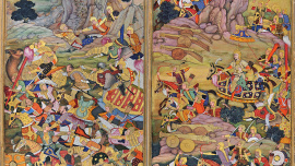
500 years after Babur's victory / How the Mughal legacy continues to shape South Asia
The lost world of Dhaka's courtesans and baijis
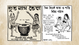
Early Bengali advertising / Ghosts, gods, and swadeshi pride

Love, faith and family: Inside World Cup players’ tattoos

Can migration help win a World Cup?
A crime history of Bengal: When rivers became a haven for dacoits
Mohajir manuscripts: Field notes from Dhaka Aliya Madrasa

What has changed since the USA ’94 World Cup? Almost everything