

Minimalism took over—but was it worth losing colour?
What lies behind the idea that the world is losing colours? Is the world truly losing its colours? These questions may almost feel poetic, but beyond poetry echoes a cultural truth; we are quietly, collectively draining colour out of our lives. This “loss of colours” did not happen overnight — it is the result of a bunch of decades of shifting tastes, technologies, and psychological influences that have slowly guided us away from the world our predecessors knew.
The change that sneaked in and the cause that sparked it
Over the past few years, almost every corner of our lives has quietly shifted toward a muted sameness.
Homes have opted for beige rooms and minimalist furniture that promise calm but often feel identical. Even our cityscapes have dulled. Building exteriors are wrapped in cement-grey blocks and glass, monochrome steel, and matte modernism.
Our wardrobes reflect the same transformation. Today, neutrals dominate closets across the world, shaped by the rise of “safe fashion” on social media. As people are more cautious economically and environmentally, they choose clothes that are reusable, multifunctional, and timeless.
Weddings, once vibrant explosions of reds, marigolds, emeralds, and intricate motifs, are now gradually adopting Western-influenced pastel palettes.
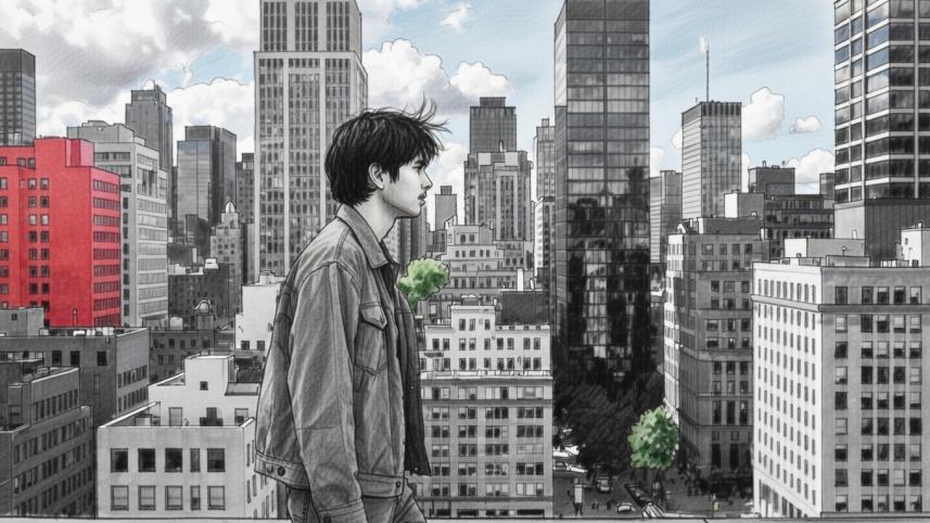
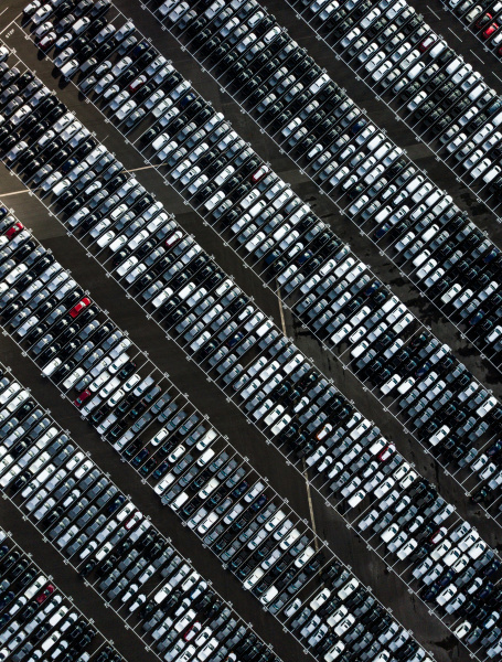
The most visible changes are our streets. Cars now move almost uniformly in shades of white, black, and silver, turning streets even more monochrome.
Even cafes and restaurants have succumbed by monotone interiors, concrete walls, and warm lighting, designed purely for social media aesthetics.
Technology intensified this shift. Digital screens favour soft tones that reduce eye strain, gradually training our preferences toward desaturated palettes in real life.
Branding and product design followed suit; logos lost colour, packaging became simpler, and public spaces leaned into greys and metallics.
From within to beyond, from personal to public, the world’s visual identity has inaudibly drifted toward uniform neutrality. And so, it seems true to say “the world lost its hue.”
The vibrant past fades into muted reality
In the early 1900s, colour was a language of excitement and modernity.
In the decades between the 1920s and the 1970s, colour enjoyed a golden age. Everyday life looked like a festival of shades.
From the 1900s to today, a decline in colour usage is clearly visible across industries. Researchers call this shift “Colour Depletion” or “Chromatic Decline.”
Between the '20s to '50s, society embraced vibrant hues everywhere. After World War II, the world entered a wave of vibrancy. Cars, posters, fashion, and interiors showcased bright and cheerful colours, reflecting post-war optimism.
Post '50s bought maximal colour to its peak as synthetic dyes became cheap and growing economies encouraged expressive consumption.
By the '80s and '90s, subtle shifts began. Though the '80s still celebrated neon and pop cultural vibrance, the influence of early digital technology introduced a preference for limited, stable colour palettes.
The 2000s marked a decisive shift in how we experienced colour and design. It may not have stolen all the saturation, but gently set the tone for a more muted era.
From 2010s onwards, the world entered the era of saturation disappearance. Minimalism became not just a design philosophy but a lifestyle statement.
Nostalgic how colours slipped through our fingers
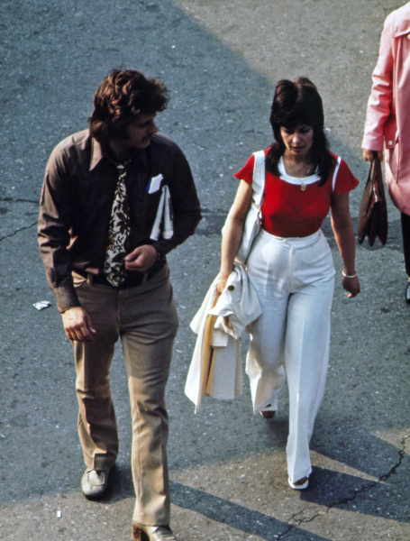
Walk into a house before the wave of minimalism and you’re greeted with walls in cheerful shades of spring green, mustard yellow, or candy pink, kitchens alive with turquoise cabinets.
Beds were draped in big, bold bedsheets in reds, yellows, greens, and blues, often patterned with sprawling florals. Sofas had cushions in stripes, checks, or vibrant floral prints, sometimes matching patterned mattresses. Curtains swung with intricate all-over designs or floral motifs, and rugs layered the floors in bright, cheerful patterns that brought the room alive.
 For all latest news, follow The Daily Star's Google News channel.
 Fashion too, was fearless. Men in patterned shirts, women in vivid sarees, scarves and bangles in every hue imaginable.
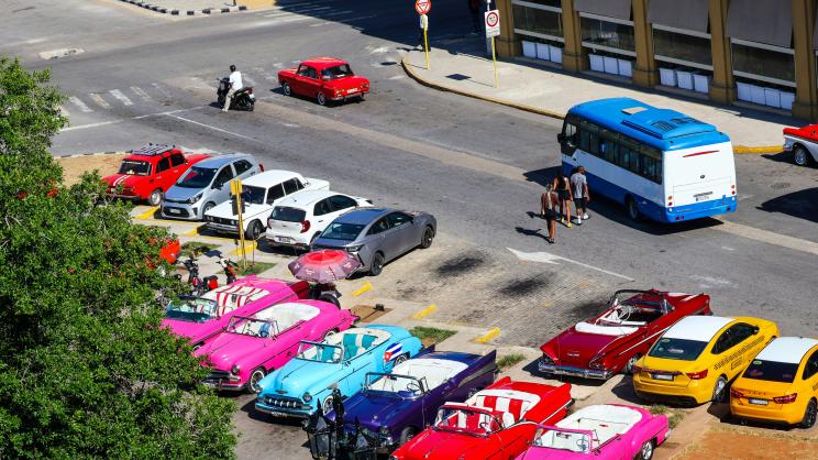
Even the streets reflected vividness. Cars in cherry red, mint green, sunflower yellow, or sky blue lined the roads, and public buildings featured colourful frontages and tiled exteriors.
Is a comeback brewing?
Culture is never one directional. Every trend creates its own rebellion. Generation Z is already experimenting with maximalist decor, retro graphics, and vivid wardrobes. The fading mirrors who we are, digitally tired, socially exposed, economically cautious and environmentally aware. Minimalism gave us calmness, but monotony may soon exhaust us. So, the pendulum may swing again from pale minimalism to bold expression.
Comments